
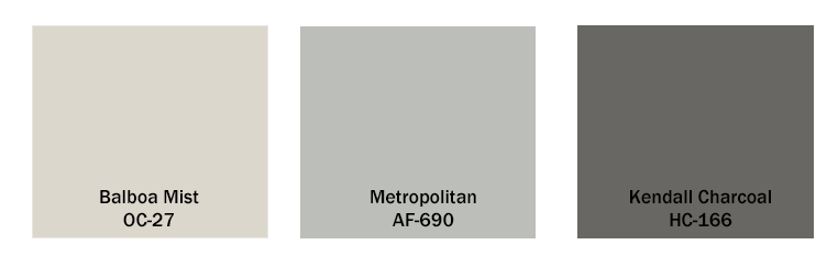
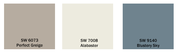
The colors here are for the most part neutral, like I said, neutral is trending. These are great because they aren’t anything too bold, or too boring. I went an extra step and used Sherwin-Williams ColorSnap® Visualizer to try out these colors on the picture of the model home. What I did here was apply the Alabaster on the majority of the 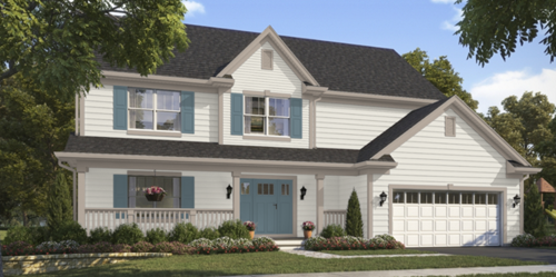 house. I then decided that the Blustery Sky color would look great on the door and shutters, kind of like a feature color. The Perfect Greige was such a nice subtle trim that was used on the porch railing, gutter and other accents of the house. If you wanted to be a little bolder with the look, I think that the Blustery Sky would look great as the garage color as well! It would give it a little something extra!
Hopefully you found a color you like in this blog post, or it inspired you to make your own color palette and pop some nice colors on the exterior of your home!
house. I then decided that the Blustery Sky color would look great on the door and shutters, kind of like a feature color. The Perfect Greige was such a nice subtle trim that was used on the porch railing, gutter and other accents of the house. If you wanted to be a little bolder with the look, I think that the Blustery Sky would look great as the garage color as well! It would give it a little something extra!
Hopefully you found a color you like in this blog post, or it inspired you to make your own color palette and pop some nice colors on the exterior of your home!