Let's get a jump start on the New Year!
Color Trends 2019
We know how difficult it can be to pick a, hopefully, “forever” color for your home so I think giving you an insight on what the color forecast, or even trends of next year are going to be, and hopefully this might help out a little bit. Also, I’m going to add a bonus of some color combinations of my own choice that I think would look great on the exterior of any home.
There were a lot of different options from different companies for what colors would be on trend next year, but out of those colors I chose some that would look great with really any type of house.

These colors are all in a collection of Benjamin Moore’s Color Trends of 2019. The paint color Metropolitan is actually the single color that Benjamin Moore chose as their color of the year for 2019. The description they give Metropolitan is, “A stylish gray with cool undertones, metropolitan reflects the modern sophistication of 21st-century design.” It really is a beautiful color. I found another beautiful quote about what this color is defined as.
“Metropolitan AF-690 emanates nuance, harmony and extravagant ease. Always adaptable, it softens to matte or shimmers with sheen. It’s neutral. It’s understated. It just is. This is color, off-duty.”
—Ellen O’Neill, Benjamin Moore & Co.
All of these colors are also fairly neutral which seems to be a trend I see in different websites. These simple colors would be great accents for the exterior of your house, these would also work really well for the interior as well. They go well with most colors and feel clean and refreshing.

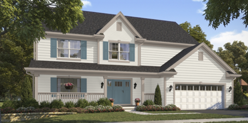
 house. I then decided that the Blustery Sky color would look great on the door and shutters, kind of like a feature color. The Perfect Greige was such a nice subtle trim that was used on the porch railing, gutter and other accents of the house. If you wanted to be a little bolder with the look, I think that the Blustery Sky would look great as the garage color as well! It would give it a little something extra!
Hopefully you found a color you like in this blog post, or it inspired you to make your own color palette and pop some nice colors on the exterior of your home!